Euromomo week 16
Printed From: Avian Flu Talk
Category: Main Forums
Forum Name: General Discussion
Forum Description: (General discussion regarding the next pandemic)
URL: http://www.avianflutalk.com/forum_posts.asp?TID=42620
Printed Date: April 26 2024 at 10:57pm
Topic: Euromomo week 16
Posted By: Dutch Josh
Subject: Euromomo week 16
Date Posted: April 30 2020 at 2:58am
|
Pooled mortality estimates from the EuroMOMO network continue to show a marked increase in excess all-cause mortality overall for the participating European countries, coinciding with the current COVID-19 pandemic. This overall excess mortality is, however, driven by a very substantial excess mortality in some countries, primarily seen in the age group of 65 years and above, but also in the age group of 15-64 years.
Note on interpretation of data: The number of deaths shown for the three most recent weeks should be interpreted with caution, as adjustments for delayed registrations may be imprecise. Furthermore, results of pooled analyses may vary depending on countries included in the weekly analyses. Pooled analyses are adjusted for variation between the included countries and for differences in the local delay in reporting. [url] https://www.euromomo.eu/graphs-and-maps/ - https://www.euromomo.eu/graphs-and-maps/ [/url] ------------- We cannot solve our problems with the same thinking we used when we created them. ~Albert Einstein |
Replies:
Posted By: EdwinSm,
Date Posted: April 30 2020 at 3:06am
|
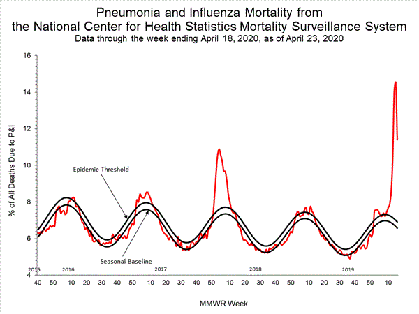
Thanks Josh. Given problems of testing and reporting, I think that the viewing of 'excessive death' statistics will be one of the best ways of getting a handle on what is happening. A different graph (% of all deaths which involve pneumonia) for a different area (the USA), but showing the same spike:-
For the latest graph (updated weekly) https://www.cdc.gov/flu/weekly/ - click here and scroll down to near the bottom of the report.. ps Both the graph that Josh posted, and the one I posted show the spike at a time when the rates should be falling. |